About the Project
patientMpower is a data collection app that focuses on empowering patients to directly record
quantitative and qualitative data on their condition and share it with their carers and doctors directly.
A flavour of the patientMpower app was developed for another client. This version required extensive
re-branding of the existing interface.
My Role
My role on this project was to re-design the UI and prototype the flow of new features being added to the
product.
When the pMp team was hired to create a flavour of the app with the client's branding, I had to express the
client's identity
through the same interface.
The Problem
When I started working for patientMpower, their interface was already quite outdated, and was creating
usability issues.
Simplifying and beautifying the interface was critical, especially considering the main user demographic for
the product is 50+ year olds with chronic diseases such as IPF, Asthma, Kidney failure etc.
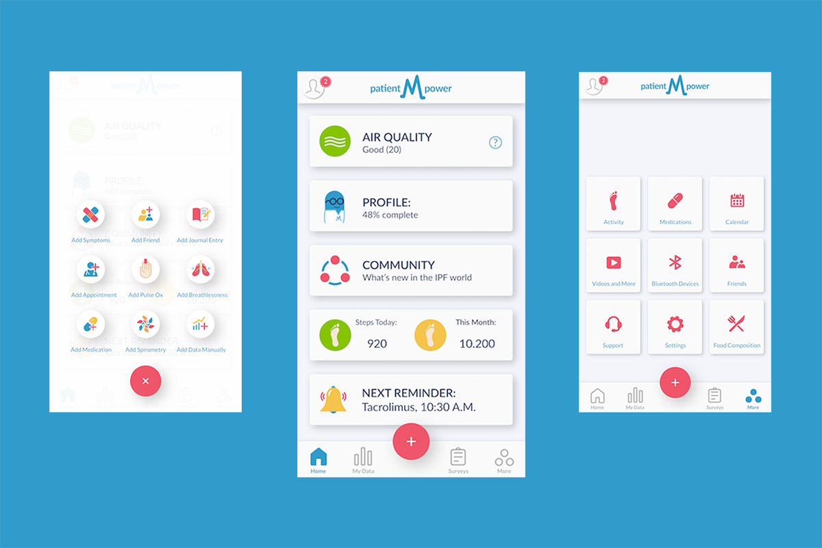
My initial approach to the re-design was to go the opposite way of the existing interface: shades of gray, few
select colours, minimalist outlined icons etc.
However the users complained that the new design felt "like a hospital", something they saw enough of already.
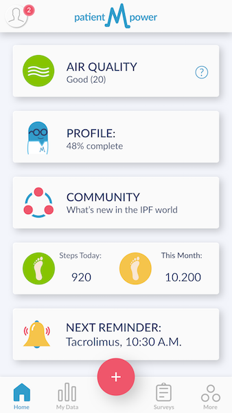
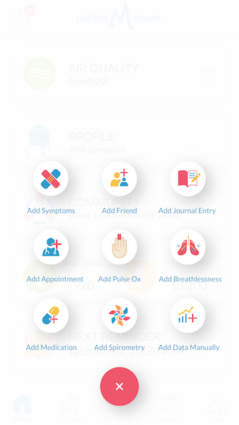
So I implemented a new approach, with colourful icons,
shades of blue and big cartoonish buttons, all based around the patientMpower mascot, Buddy.
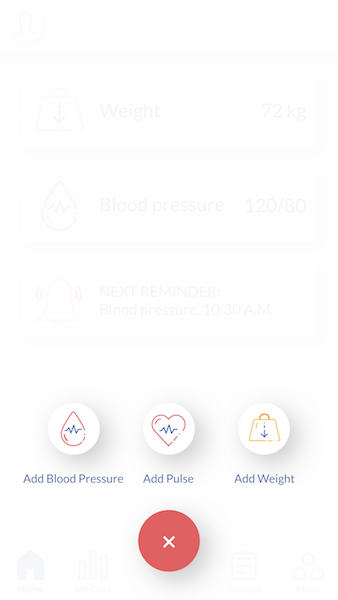
Re-Branding
The client are still developing their identity as a brand, so I didn't have much to work off when laying
out a strategy for their version of the app.
I started with the colour used in their logo, a quite saturated blue, and worked out a palette of
complimentary colours from it. I then used this palette to colour
the app icons I was designing. When it came to the latter, I created a number of variants for the
client to choose from. All were outlined and minimalistic, albeit still colourful.
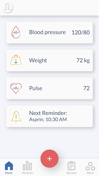
The Final Design
The final design for the patientMpower and client apps is a good example of how branding can be
expressed
strongly and used to differentiate between products,
even if the functions and layout of the app are the same.
What I Learnt
Expressing a brand's identity through an interface is possible via a few subtle details: from font style, to
colours used, to a slight change in icon design.
All these things can easily change the feel of any virtual environment, and can help influence the user's
perception of your brand.

Back