About the Projects
During my time at The Irish Times, I have been involved in a number of major projects; both for
internal technologies and customer facing solutions.
I was part of a diverse, multi-cultural team and we regularly did design workshops, user research,
and idea scoping sessions.
We were also a multi-disciplinary team, which means our duties didn't just cover UX Research and
Design, but also branding, UI Design and front-end development.
My Role
My role changed depending on the project, but since my strengths lie more towards coding and
front-end development,
I often found myself involved in projects that required good technical knowledge.
The following are some of the larger projects I was involved in:
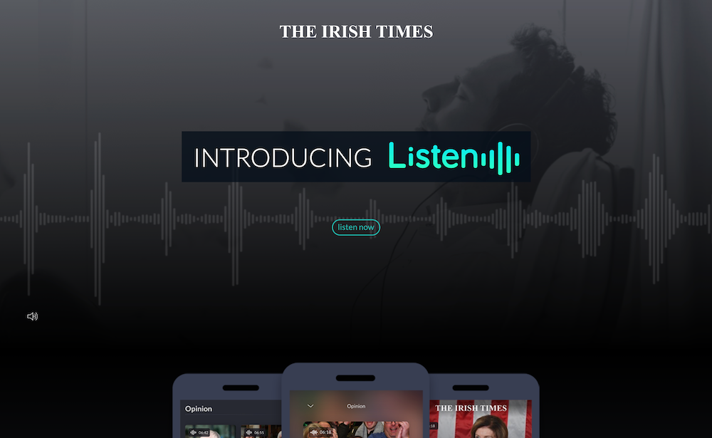
Listen was an extensive exercise of research, implementation and branding.
It empowers the user to listen to an article rather than reading it,
as well as allowing users to scroll through all Listen articles by section.
I was involved in the entire process, from initial branding research and design, to
interface design and implementation, alongside the rest of the UX team. My single-handed
contribution was the
Listen mini website that was used to advertise the product on launch, which I designed and built.
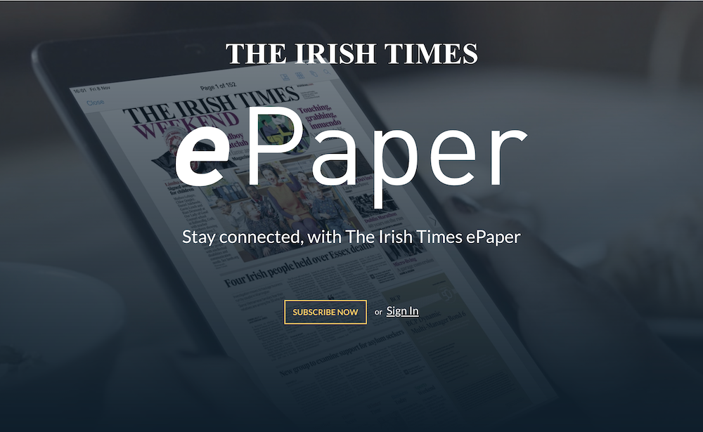
The Irish Times' ePaper is an exact digital replica of the printed paper.
Available to premium subscribers, it's an exclusive way to read the newspaper as if it
was the printed version,
but without having to buy it from a stall or have it delivered. It also comes with
archive and search functions.
I was tasked with designing and implementing the ePaper mini website
that we use to advertise the product.
Re-designs
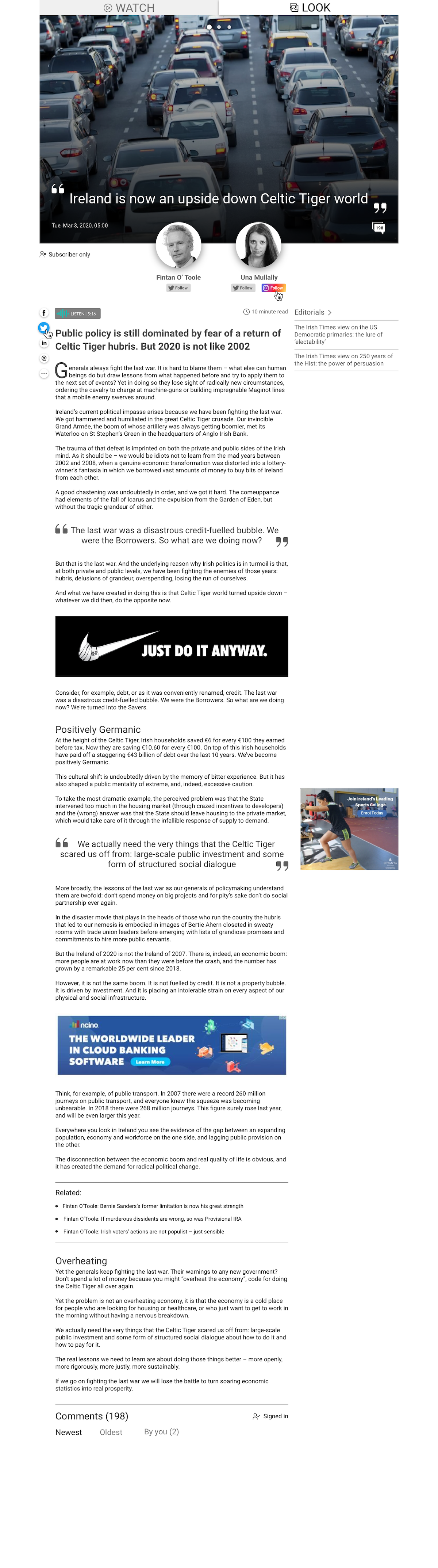
Article template re-design
This was one of my proposed designs for the article pages.
The challenge was to clearly communicate to the user what features the article contained:
articles could contain video, photo-galleries or both, and they may also have needed to
be listenable, as well as having a comment section.
In my design, I took an article that contains all of these elements, and made them clearly
accessible to the user within the header section: the tabs “look" and "watch" gave access
to the video or the photos on selection, while the icon in the bottom-right corner of the header
showed the number of comments, and would navigate the user to the comments section if clicked on.
The "Listen" button allowed the user to listen to the article, while further icons
provided info about the type of article (Subscriber Only), the authors, and allowed the user to
follow them on social media, as well as providing sharing options for the article itself.
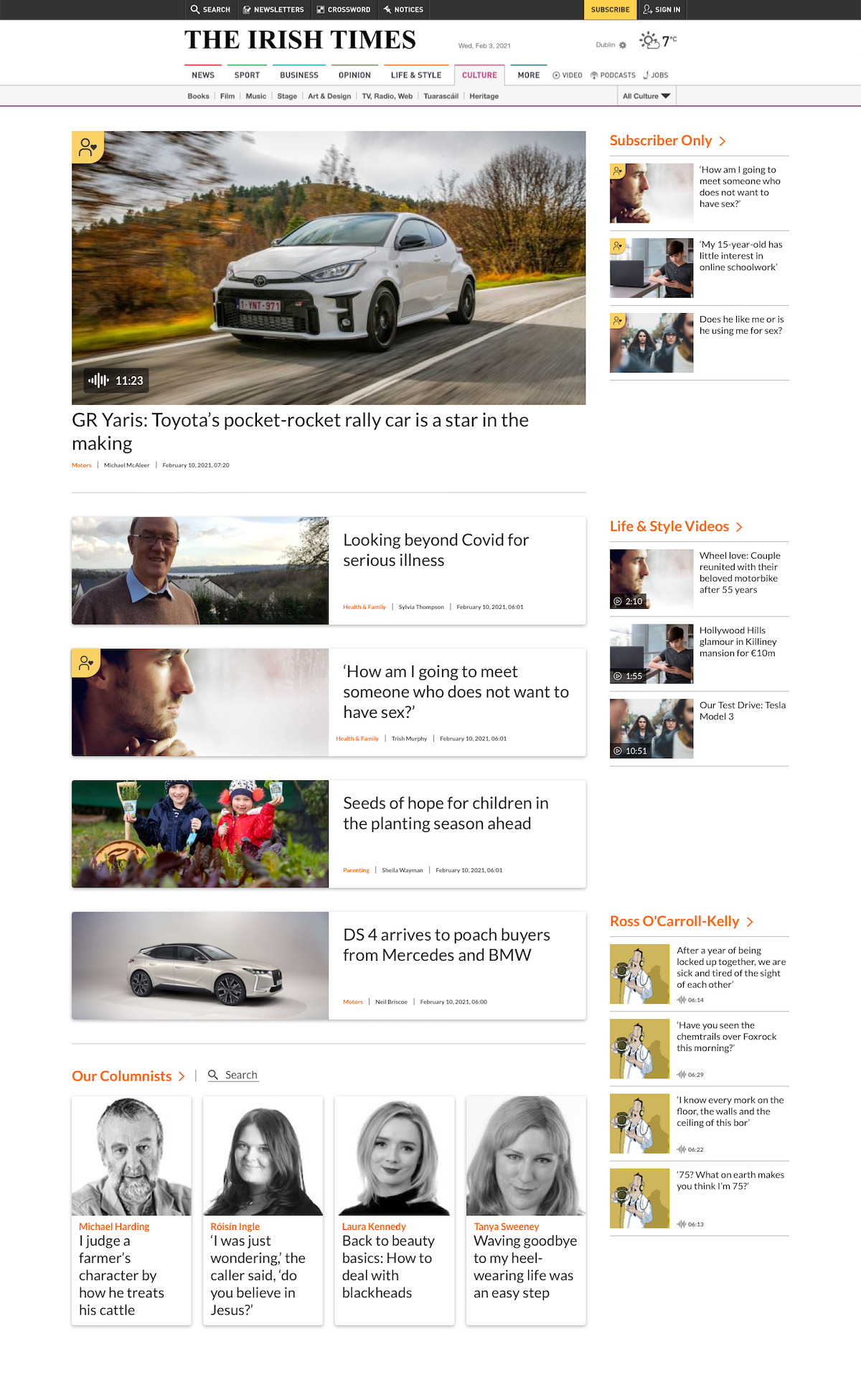
Index page re-design
This was one of my proposed designs for the index pages: creating sections of the website that grouped
articles with the same section tags together.
The index pages had to grant the user access to each article relevant to the selected section (in this case, "Life & Style").
Each article preview needed to show clearly whether it was a "Subscriber Only” article, whether it was listenable, and whether it contained video.
Columnists that had recently published an article had to be displayed, as well as sub-sections that were particularly popular,
and suggested groupings such as "Video", "Subscriber Only" articles, etc.
The "Listen" button allowed the user to listen to the article, while further icons provided info about the type of article (Subscriber Only),
the authors, and allowed the user to follow them on social media, as well as providing sharing options for the article itself.
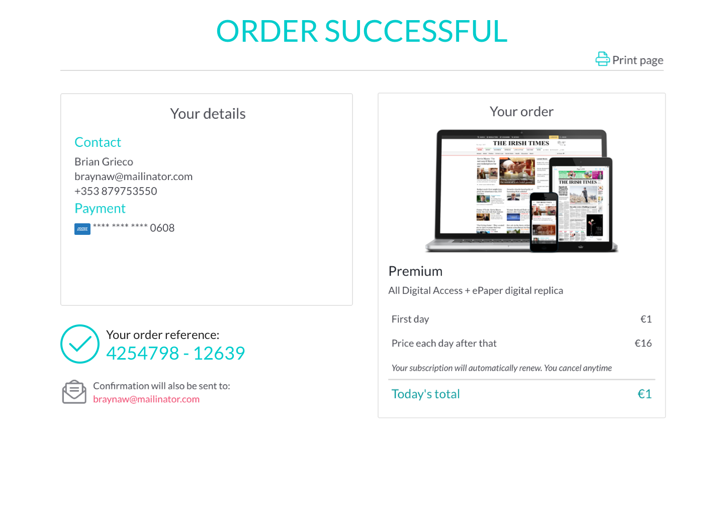
Confirmation page re-design
This was one of my proposed designs for the "Order Confirmation" page that appears at the end of the e-commerce funnel.
All the essential information was presented neatly, with the header reassuring the user of the operation's success.
The user's details and the order details were contained in their own seperate boxes, allowing for easy scanning of the information,
while the order confirmation number was given its own spotlight, unbound by borders.
The possibility to print the page was also included, and the imagery in the "Your Order" box reflected exactly what the user had paid for.
What I Learnt
My experience with The Irish Times has been long, positive, and varied. From user research, to
re-designs and improvements, to front-end development,
to bringing both internal and customer-facing products from mere ideas to full deployment, to
mentoring interns.
Thanks to these experiences, I have aquired many soft and hard skills, especially in the areas of
teamwork, front-end development, and mentoring.

Back